
SHOP MY HOME WISHLIST


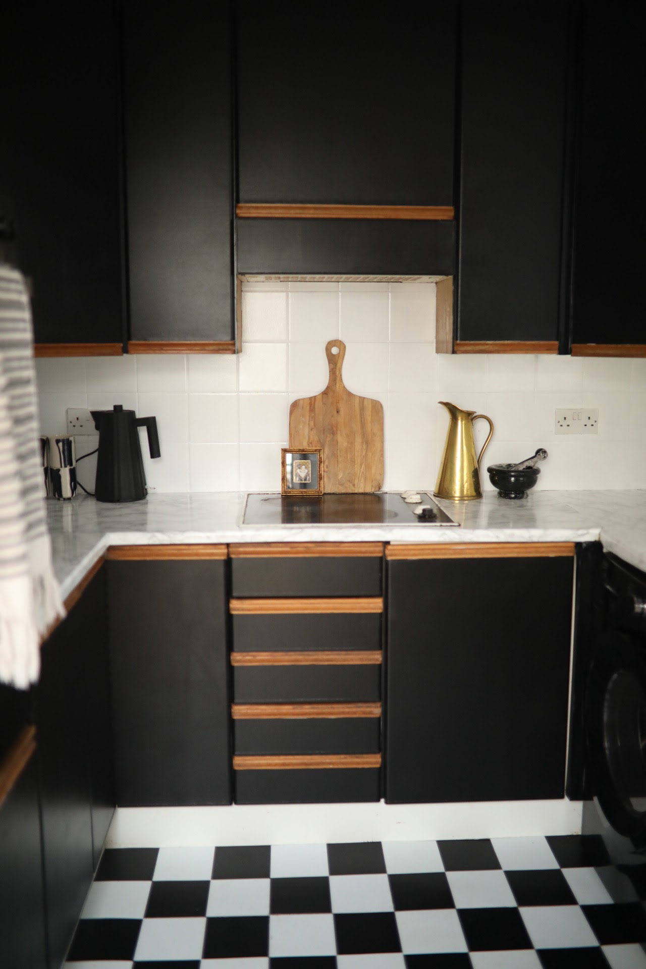
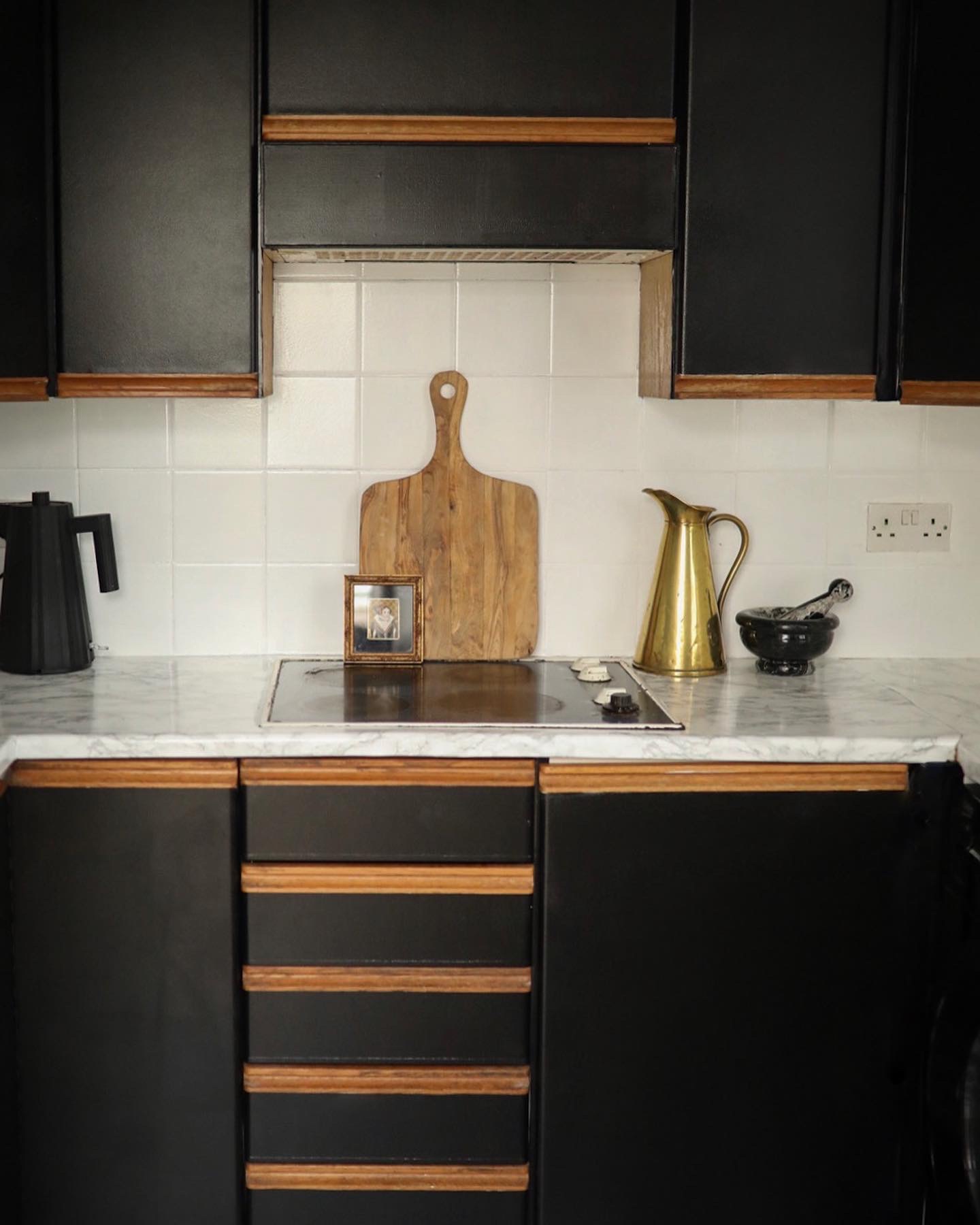
Firstly, can you believe this is the same kitchen? See the before below!

It's seen quite the glow up!
We moved into our new house in October 2020. When I say new, it's a 1887 Victorian semi detached house and it needs everything doing! I'm talking floral wallpaper.. matching carpets - the lot! So, at the moment the kitchen is not a priority for us. We've got the usual victorian lay out, so our kitchen is sat right at the back the house and it is tiny! Realistically we need to add a side extension to extend the width to give the kitchen the space it deserves. However at the moment I think it makes sense to work with the space we already have (the rest of the house.) So, for now the kitchen needed a little "glow up" on a tight budget of £100.
So, armed with a few essentials I got to work!

First of all, the red tiles had to go! I used Ronseal One Coat Tile Paint whilst It wasn't exactly a one coat job, it did the trick in covering the nasty red tiles - all in all, it took 3 coats. If you have a lighter colour tile you may be lucky and only need 1/2 coats but for a brighter/darker colour the more coats the better coverage in my experience.
I used a small roller to apply each coat which I wrapped up in clingfilm after each use to keep it from drying out between coats. I hate washing brushes and rollers so this avoided having to wash them between uses.


See the difference between coat one and coat two?

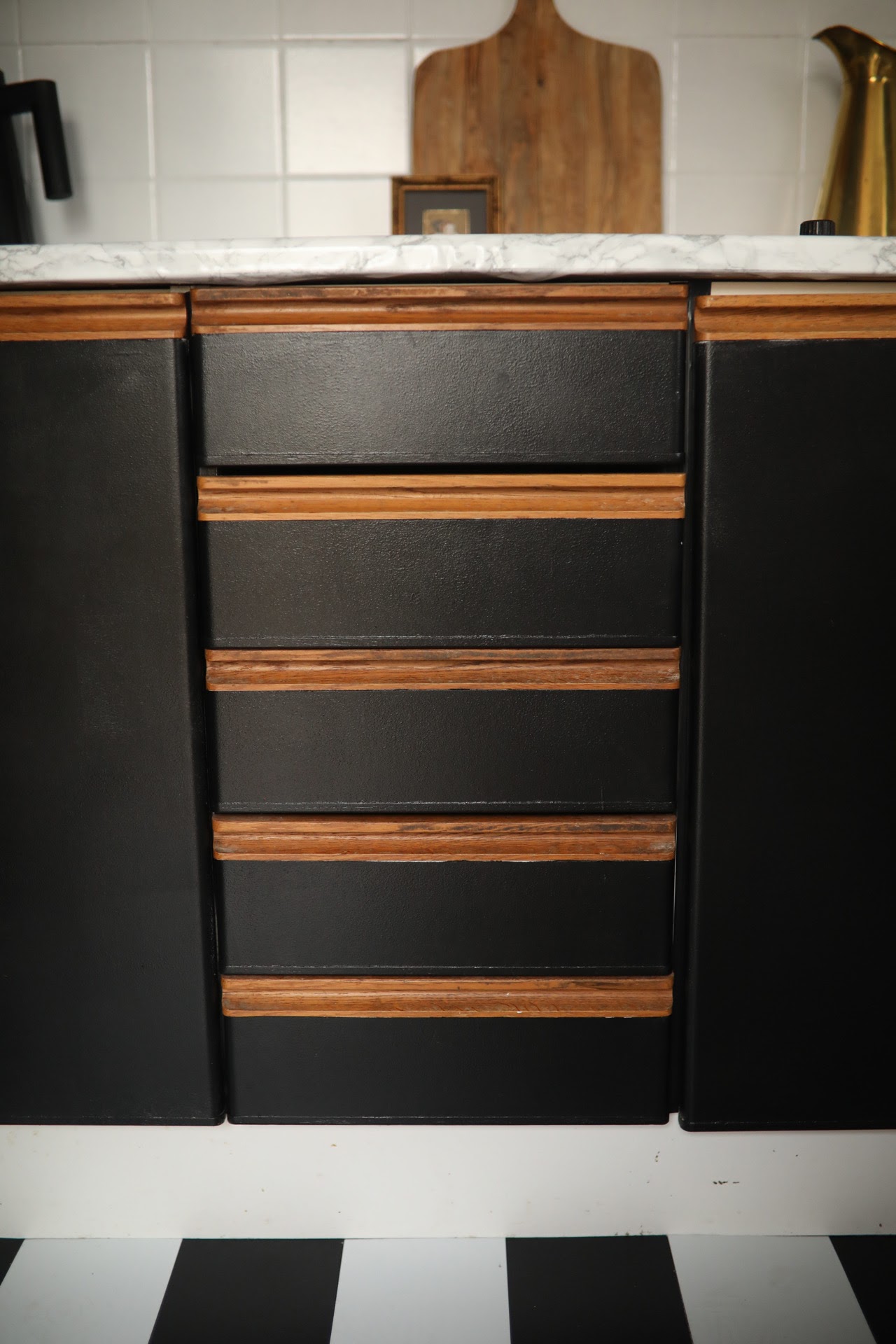
The cabinets had a weird vinyl texture to them so to help the paint adhere to the cabinets, I primed them using Zinssser 1,2,3 Primer. This primer is incredible and I know I'm going to be using this on everything going forward. Anything to avoid having to sand! This stuff will prime any surface for painting!
To paint I used a regular black wall paint with a foam roller. I probably should have used a specific cabinet paint to be honest but the Dulux Walls and Ceiling in Rich Black did the job! It was in the sale and has lasted so well considering the daily use of the kitchen, so I don't think It matters too much. Like I said, this is a temporary fix for a year or so so I'm not too worried.

The worktop was in okay condition however it had an off blue tinge to it, so I thought it would be quick and easy to apply a vinyl wrap to the worktops. I purchased three rolls of the DC Fix marble effect vinyl which was more than enough. I purchased more than I needed as I wanted the hob to have an entire stretch of vinyl without any cuts, and the same with the sink. So the only joins are where each side meets the next direction of worktop. This did take time and patience but it was SO worth it. It's a great quick fix if you fancy a change with minimal faff.

Again, another quick and temporary fix that would work in any room.. self adhesive tiles. They'd look great in a rented bathroom! You simply cut to size if needed, un peel the sticker off the bottom and laid each one down, starting in the corner. They're not an actual tile, more of a thicker plastic material. They're super easy to clean and have held up with all the traffic in the kitchen.
They've really helped transformed the space!


And that's it! All the other accessories I've bought in from other rooms to help style the space.
What do you think?



Ronseal Tile Paint - Dulux Rich Black Paint - Zinsser Primer - DC Fix Marble Vinyl - Self Adhesive Floor Tiles
Post a Comment

We moved into our new home back in October 2020, in the midst of a pandemic! Whilst I do not recommend this.. hear me out! We saw this house back in December 2019! Having seen the house on a whim and having no intentions to move prior to viewing the house.. I put our old house up for sale the very same day! I'm very impulsive like that. Our house was snapped up by the first buyers that viewed it - perfect we thought! However, throw Cornovarius, a global pandemic, and sadly probate into the mix.. It wasn't as straight forward as we thought it was going to be. Anyway, 10 months later we finally moved into our beautiful semi detached Victorian house in Brighton, UK.
The first room we are focusing our attention on is the living room! We're living in the house whilst we renovate which I know isn't everyones cup of tea but we've got enough space to shift from room to room and it suits us fine.
The living room is first because we spend most and if not all of our time in here. So in my eyes it makes sense to get one room looking lovely and have somewhere clean and functional to retreat to whilst we tackle the rest of the house.

The living room has some gorgeous original Victorian features - which is what drew me to the house in the beginning! I could see way past the floral wallpaper and interesting.. carpets. We've got high ceilings, a huge bay window, intricate cornicing and a beautiful ceiling rose to work with - the room has amazing bones.
I've attached photos below if you're interested in its current state. It's hard to believe the mismatch of pattern and brick tiles were once on trend!
So, the plan. I'm hoping to work with all the original features we have in the room, including the original wide floorboards we've discovered underneath that questionable carpet. I'm thinking of having them stripped back to their original state and just staining them with a clear oil to keep them looking lovely.
For the walls I'm hoping to find the perfect warm white. Our living room is west facing so we get some lovely sunlight until midday through the bay windows.. and after that its a little dark. So a warm white should pick the light up in the room. I've got testers of Farrow&Ball "School house white" and Little Greene "Slaked Lim Mid'
I've scoured Facebook Marketplace and so far picked up the marble surround for £100. ( I know, I hate me too.) The vintage Younger Toledo cabinet on the left I've picked up more recently for £150 - I'm thinking of stripping back the wood and giving it an Eyeswoon vibe!
I want to add hints of black around the room to really add some interest. So I'd really love to find some reclaimed 4 panel Victorian doors which we can paint black to make a statement in the room.
I think a Sofa will be the last item on my list as we're still in lockdown at the moment, Sofa showrooms are closed for the forseeable. Something neutral in colour, natural in material.. and lastly bloody comfy! A high back.. a deep seat.. something we can really sink into - I can't wait!


Home buys.
I'm currently of the hunt for our next house, the family house. Preferably an older Victorian property boasting original features; high ceilings, parquet flooring, ceiling roses, the list goes on!
Whilst the hunt for the dream house continues, it's got me thinking interiors! So, I've complied 10 of the best home pieces I've got my eye on at the moment..


We finished decorating our bedroom a good couple of months now, and whilst I'm insanely pleased with how the room looks on an interior level there's one thing missing, a comfortable nights sleep. We bought our house in August last year and being in such a rush to sleep in our new home the day we picked up the keys we rushed out and bought the first mattress we found, not bothered about the mattress in general just the excitement of having our first nights sleep in our new home.
Almost a year later, and whilst the excitement of owning our first home is still there, the thought of going to sleep at night was an instant dread. An uncomfortable mattress together with numerous deadlines and being unable to switch off at the best of times doesn't exactly achieve the best nights sleep. And that's when The Leesa Mattress stepped in.
The Leesa Mattress is designed with one goal in mind: to help people get a better nights sleep. With their 100 night risk free trial and delivered and built in 5-7 business days you have more than enough time to suss out whether The Leesa Mattress is for you, and if it's not they donate the mattress to a charitable organisation and provide a full refund. So what's to lose?
Don't get me wrong, I was sceptical about buying a mattress online that I hadn't already tried out. But, the thought of the 100 night's trial soon pushed that doubt to the back of my mind.


The Leesa Mattress is built with three foam layers that adjust to your body to provide optimum support. The 5cm thick top layer is made of Avena foam which is a responsive material that allows airflow through the mattress for a cooler nights sleep. Perfect for the heatwave we're experiencing in the UK! The 5cm thick middle layer made up of memory foam and the 15cm thick bottom layer adapts to your body providing optimum support and comfort.
The Leesa Mattress is delivered compressed and rolled into a box just 106cm tall. Unboxing couldn't be easier. I simply unboxed the mattress in our bedroom, placed on the slats, remove the inner and outer plastic whilst unrolling the mattress and watch it expand and take shape.
I'm not sure I've ever said this about a mattress before but it suits our bedroom perfectly! The Leesa Mattress is a gorgeous light grey colour featuring four white iconic stripes at the bottom of the mattress.

Initially laying down on The Leesa Mattress I was sceptical about it being too firm compared to the soft mattress we've been sleeping on for the past year. But, after just a couple of nights sleep I couldn't be happier when I wake up in the morning. I fall sleep comfortable and enveloped in the foam layers until my alarm goes off the next morning. I can hardly feel my boyfriend moving in the night and the amount of tossing and turning has reduced significantly.
Thank you Leesa for giving me back those 8 hours.


For £100 off a Leesa Mattress use code "AFASHIONFIX"
This post was made in collaboration with Leesa.

If you've been following my renovation journey on Instagram then you'll be familiar with our bedroom-the next room checked off of our list. We gave the room a well needed lick of paint, cleaned up the carpets and furnished the room from head to toe. There was just one large bare wall staring back at me upon completion and I knew it just had to be a gallery wall.
So, with the help of Desenio we turned this empty in space into a feature wall! I often find myself playing around with this space to freshen up this wall every now and then and it gives it a whole new look each time! I've written a couple of words of wisdom below to hopefully give you steps into creating your very own gallery wall.
I've included a discount code at the bottom of this post to give you 25% off posters between 24th-26th April! (Not valid on frames and handpicked.)


To start of I painted these white picture ledges the same colour as the walls. I've gone with picture ledges as I really like changing up the look without having committing to drilling into the walls, although this technique can also work for your typical gallery wall, or a mix of the two! I'm planning on switching to a gallery wall once I'm happy with how everything looks.
To create the perfect gallery wall I start off by choosing the posters and frames I want to display. Once I've placed my order and everything has arrived I start by laying everything out to decide which posters I'm going to use and where they're going to sit. It find it works best to mix your sizes-I've chosen a mixture of 13x18cm, 21x30cm and 30x40cm. You'll also notice I've chosen portrait and landscape which I really like, the mixture of heights is really pleasing to the eye. I've also mixed up the colours of the frames and gone for black, white and oak.


Once I've figured out which posters are going where I take a step back and take it all in. As I've chosen 5 posters and I've got some large gaps I thought it would look amazing to mix in a couple of my favourite black and white magazines. (They're usually kept in a pile on the floor so this is a real space saver-and looks super chic!) I then display these around the frames until I'm happy.


Lastly, to break up the posters and magazines I've added small trinkets, jewellery, candles and beauty products displayed in and around the ledges. There's no art to this, I don't want anything to look symmetrical and "done" I just want it look as if it's just been put there. (Even if it has taken me an hour to display it all!)
And that's it! What do you think?


Shop The Posters
Hide - Size 13x18cm
Frame - Oak Size A5
Vintage Car - Size 21x30cm
Frame - White Size 21x30cm
Again Tomorrow - Size 21x30cm
Frame - Black Size 21x30cm
Calendar - Size 30x40cm
Frame - White Size 30x40cm
Eucalyptus Branch - Size 21x30cm
Frame - Oak Size 21x30cm
The Code "hannahcrosskey" gives you 25% off posters* between 24th-26th April!
Not valid on frames and handpicked.

This post was made in collaboration with Desenio.

If you follow me on Instagram or here over on A Fashion Fix, you'll know we bought our first home in Brighton in August last year and we're in the process of renovating. Our first project was the bathroom which you can read about here. Now, we've turned out attention to the Bedroom with a little help from French Connection.
I will be posting a full before and after post but for now here is the room in all it's glory! The room was in a really good state when we moved in, all we had to do was remove the old wallpaper on the back wall (behind the bed), fill in a couple of small holes (mainly from my poor removal of wallpaper..) and give the room a lick of paint it well and truly needed.
Some of you might be wondering how does French Connection fit in with my bedroom tour? Well, if you're not already aware French Connection stock their very own homeware. From parquet console tables, to their famous poppy field rug-these guys are my go-to for furniture and furnishings, I couldn't get over the amount of you that weren't in the know!


My favourite piece in the room aside from the bed, are these round tray table bedside tables. I asked a lot of you for advice regarding bedside tables as I wasn't sure what style to go for and you all said natural wood-and I'm so glad I listened to you! The reclaimed wood looks amazing against the metal base, and I think really compliments the cosy and serene vibe I'm going for in here.
I've layered a lot of soft furnishings over the bed. I really like how this knitted cushion and aztec throw look against the white and soft grey washed cotton duvet. I really wanted to keep the colours in this room muted so you'll notice there's a lot of greys and small pops of colours to compliment that.


I've added the addition of the woven footstool in front of the bay window. I wasn't actually going to include anything in this space but it ended up looking super empty (and drawing too much attention to the radiator.) It's made from mango wood and has the most incredible detailing making it a real accent piece. How incredible is the weaving detail? I often find myself sat there writing (as I am as we speak) It's so nice to sit and watch the sun light flood the room.


I've accumulated a lot of magazines these past few years so I knew I needed to show them off. We don't have a great deal of floor space in this room so popping them onto picture ledges on the wall was the perfect solution. I've styled these ledges with some of my favourite things like as these cowhide candles which smell incredible.


Upon entering our bedroom there's quiet a small walk through to the wardrobe so we needed a console table to house all my unessecary but beautiful clutter. Something narrow and space saving. This industrial Timber console table is only 35cm wide which was perfect, the mango wood table top is such a gorgeous washed grey and really compliments the iron base. It's actually really space saving being a console table as it's open I'm able to store things underneath without it looking too bulky for the space.


Lastly the wardrobe. If you follow me on Instagram you would have seen the progress in this room. I'm really chuffed with how it's worked out especially as we've put in all the work ourselves. ( I even built the wardrobes myself!) It's gone from a bare room with one hanging rail to a beautiful walk in wardrobe. This Vintage King rug adds just the right amount of colour and design we need in this room.
Shop The Bedroom
This post was made in collaboration with French Connection.
Subscribe to:
Posts (Atom)